Pages

Monday, June 23, 2014

Toning Down Bright Colors

I picked up a great set of Kling solid hard rock maple bedroom furniture, which included a chest, vanity, stool and mirror.  I didn't want this to be refinished as a 'set' so I painted the vanity, mirror and stool together.  I'll show you the 'relove' of the chest in a later post.  Here's the picture of the vanity....


I loved the legs, fluting on the sides, quality construction, but wasn't crazy about the knobs.  As always, I stripped the top and although it was maple, it was in good shape and decided to stain it.

I've been enjoying using the Milk Paints from General Finishes.  I love the silky smooth way it goes on, and easy clean up.  So Halcyon Blue was my vision for this piece.  I applied one coat of ASCP Old Ochre and then a coat of the Halcyon Blue.  Ug!  The Halcyon Blue is way brighter than what I envisioned!  What to do?  I'm thinking a wash of a toned down blue would soften the look...so let's test it out on my trusty paper plate.


Yep!  I'm liking the look of the ASCP Duck Egg Blue as a wash over the Halcyon.


I had a couple of options for the fabric on the stool & knobs for the drawers..  The fabric on the pillow pictured here was one option along with the knobs pictured here....


But my Facebook family voted on a paisley fabric (thanks, Mary & to everyone else who weighed in!).


And the customer who adopted the vanity voted on glass knobs:


They didn't need the stool or mirror, so I still have those two pieces....but they loved the color, fluting detail and refinished top.  Their floors are hardwood and they had been looking for a blue desk with wood top.  I used the Minwax Dark Walnut stain, and the entire piece received the General Finishes High Performance Poly Top Coats.  I really like that product!


So there you have it....a wash in a softer, more muted shade was perfect for toning down the brightness of the original blue.

Thanks for stopping by!

Robin

Linking up at:


Thursday, May 22, 2014

Provence & Gold = Gorgeous

If you're wondering what has happened to me and my blog...well, it's my photography!  It's giving me a fit...I want my pictures to be pretty.  Figuring out settings, lighting and editing just don't come easily for me.  To find some acceptable pictures and then write about it is becoming a chore.  Anyway, I still love painting and if I can write a post every now and then that is helpful to at least one person, then the 'chore' is so worth it!  

I found a pretty little table in a thrift store.  Unfortunately, I forgot the 'before' pics...but it was brown and tired!  I haven't done much with layering lately or painted anything in Provence, so let's get this party started!

I first painted the entire piece in ASCP Old Ochre and then a coat of ASCP Provence.


This is the first picture of the 'in progess".  It also shows a little ASCP Old White in the curves and crevices and some slight distressing. This was my original vision at this stage...but I just wasn't feeling it.  It just needed a little something else.

How about a little gold gilding wax on the high points...and maybe some General Finishes glaze to deepen the color value a bit?


I love how the chalk paint creates some texture for the the glaze to take hold of.  And hints of Old White in the crevices helps to emphasize the beautiful curves of this lovely table.

I added just a smidge of the gold gilding wax on the very edge of the table top...


And here she is in her entirety!


I regret not having a 'before' picture.  I am still amazed at how paint can transform a piece!

Thanks for stopping by!

Robin

Linking up at:


Thursday, May 8, 2014

Adding a Little Peacock Blue to My Portfolio

As a student of Annie Sloan Chalk Paints, I have long admired and enjoyed working with her subtle colors of grays, creams, whites, blacks and blues.  They are lovely and elegant and in sync with my personal style.  However, every magazine I pick up has pictures of pieces with "a pop of color".  There is a strong desire in today's design to add bright, vibrant colors to decorating schemes.  As I am just discovering the wonders of General Finishes Milk Paint, my eye caught their Corinth Blue.  So let's start the journey:

Here is the "Before" minus the hardware....typical 1970s style end table.  Good bones, wonderful deep drawer for storage, but very average looking. 


I gave them (yes, there is a pair) a good sanding and then scrubbing with steel wool and denatured alcohol.  I'm not sure this much prep is necessary, but when starting out with a new product, I'd prefer to take extra steps for durability until I fully understand the product I am working with.

I've used the GF Lamp Black and loved how it covered....and the Corinth Blue was no different.  


The color is gorgeous and helps bring out the interesting design of the drawers and legs.  The blue is a bit bright (for my conservative eyes!) so I used the General Finishes Van Dyke Brown glaze to help tone down the brightness.  I also chose to use their High Performance Poly Top Coat.  It gives a smooth, and very durable finish.  You do have to be mindful of drips when applying it, so if you give it a try, keep an eye out for a drip to sneak up on you!  :)  I just keep a small artist brush nearby and smooth out the drip....The poly levels beautifully and gives a very even finish.


I was thrilled when I picked these up to learn they still had the original hardware!


Although this bright color was not in my normal "wheelhouse", you can expect to see more of this from RPK.  I was delighted with the outcome and am hopeful they find a loving home that needs a 'pop of color'!


Thank you so much for stopping by!


Linking To:


Tuesday, April 29, 2014

Hitting a Snag

It's been awhile since I've written a post.  One of my dear customers had a bit of an "oops" and it's taken the wind out of my sails.  I came into possession a lovely Dixie dresser and chest....and thought she would love it.


After she saw the pictures of the 'unloved' pieces, she fell in love with them.  Her vision was a black base, darker than the traditional walnut stain I generally use, and pewter hardware.  Done!

During the 'relove' process, I kept her up to date on the progress:  Tops stripped and looking good, hardware done, drawers and base prepped, painted and top coats applied.  Top getting the final stain and top coats....Let's make a plan for the hand off.  She was so excited!  On this beautiful sunny, spring day, she had hubby, daughter and daughter's boyfriend with her to help load these two gorgeous pieces.  This was her time away from her home...just an hour or so.  Why is that a big deal, you might ask?  Well, you see, she has a special needs child, so most of her waking hours are spent loving him, trying to anticipate his needs and next move.  Decorating her home is her one 'vice' and it gives her so much pleasure.

She walked into the house and saw them:


Another happy adoption.  Let's load 'em up and get 'em home.

An hour later I receive the following text:

Robin, I am heart broken, one of the drawers fell out of the truck on the highway.  Honestly I just now stopped crying.  Do you know of any way that we can get another matching drawer.  It was the top left drawer of the dresser.  :(

My heart stopped.  This dresser is from the late 1950s...not like we can call the company and order another drawer.  So my quest to help her resolve this has begun.  But my stride has slowed, thus no new posts.

We've found someone who can make the drawer...but there is a lovely rope detail in the bottom lip of the drawer that we are having trouble duplicating.  No mill rooms in this area can or are willing to make it....

This was the only close up I had showing the rope detail...not very clear but you get the idea:


And then, one of the dearest, kindest ladies in this business posted a picture of the exact dresser on her blog:


Do you guys know Danielle at Finding Silver Pennies?  If not, I suggest you check out her blog.  She is so creative and shares so much of her process with all of us.  Thank you, Danielle!

Anyway, we exchanged emails and she said she would reach out to some fellow DIYers to see if they had any ideas on how to recreate this molding.  That got me thinking...I should also be reaching out.

So here I am.  Do you have any ideas on how to make a form and duplicate this trim?  I've read lots of tutorials, but all of the appliques made were flat.  Because this drawer has a radius, the mold can not lay flat, which would also make it hard to pour any liquid substance into a mold that has an arc to it.  I'M STUMPED.  I know DoItYourselfChic makes flexible appliques which would be perfect, but their rope applique it too big for this project.  Any thoughts???

Thank you for listening....I hope somehow this gets resolved and my lovely client can get her new bedroom put together.

Robin

Linking to:


Thursday, March 20, 2014

Another Vintage Buffet

I do enjoy working on these vintage buffets.  I need to venture away from painting them black, but they look so handsome, especially when the top has been refinished in a warm, dark walnut stain.  This guy was no different....Strip the top, paint the base....and find him a loving home.


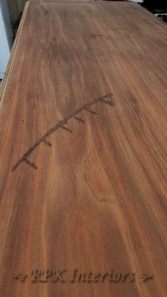
Well, he certainly had a mind of his own!  After stripping and sanding the top, there were some nasty marks that were giving me some 'conversation'!  Ha!  That was one of my father's favorite expressions when something or someone wasn't behaving correctly...."Don't give me any conversation".  Of course, those words were never directed at me, because, well you know...I was perfect in his eyes!  :)  Anyway, back to the task at hand...this top.  Check out those marks:


What is that mark from?  Looks like some kind of hot iron?  And if you look at the top of the picture, you can see some circular marks, most likely from water....

After several applications of Barkeepers Friend (thank you, Fiona for the tip), I started to see some improvement.


Pretty cool...eh?  The black iron marks are completely gone, but the circular water marks just aren't going to fully disappear.


Aren't they just darling???? Oh well, I'm several days into this now, and have decided it is time to start singing "You gotta know when to hold 'em, and when to fold 'em".  No stained top for this guy.


ASCP Graphite with some acrylic black added to darken it up.  I did use several coats of poly on the top for durability.


I spend a ton of time on the interiors of drawers...trying to restore them to their original beauty.  However, these drawers had some stains that weren't budging, so I chose to line them in a French Script style paper...


I have another similar buffet in my possession.  I'm going to try to fight the urge to paint it black...but no promises!  :)

Thank you for stopping by!

Robin

Linking Up At:


Thursday, March 13, 2014

Mixing Paint Colors

I enjoy working with Annie Sloan Chalk Paint.  I understand it and for the most part, I know what to expect from it.  However, and I am not sure why, I rarely use her colors straight out the can.  I'm always adding a little bit of this, or a little bit of that!  I don't understand what drives me to mix colors...because her colors are lovely, just the way they are.  Oh well...I mix colors, so let's get on with it.

I found a beautiful vintage chest, with the prettiest details.  It was in sad shape, with some veneer damage.  It had been stored in someone's basement for many years.  I apologize for not having any 'before' pictures.

We are in the midst of a long, cold winter, and I'm in the mood for a soft aqua. I pull out Provence, Duck Egg Blue and Old White.  I'm not quite ready for straight Provence....I think it is a very strong color...and if you look at my other projects, I tend to be very conservative with my color choices.  I had just completed a French chest in Duck Egg Blue and it really was so lovely.  Hmmm...let's start mixing and see what I come up with.


I love using white paper plates to play with colors.  It's not very fancy, but it works!  :)  As soon as I put the Duck Egg and Provence on the plate, I knew I would use some variation of Provence.  After adding Old White in different ratios, I've arrived at the color value, but it's too baby bluish.  Maybe a little Aubusson Blue will deepen it just a tad.  Oh look, I have a custom mix from a previous job that is comprised of Aubusson Blue and Old Ochre. 


Here's a picture of the chest done in this custom mix of Aubusson Blue & Old Ochre:


I drizzle a little of this darker mixture in to my Provence/Old White mixture and come up with a lovely aqua.

I know I want to have this piece feel layered, so my first coat is Old Ochre.  Then a few coats of my 'magic aqua', some distressing, clear and dark wax....


We find these pieces, we give them love...and this one has a custom color which makes it truly a one of a kind piece.

Thanks for stopping by!

Robin


Thursday, March 6, 2014

These Buffets are So Versatile

A vintage Drexel buffet with a custom glass top doesn't come along every day.  I held onto this piece for awhile before I started working on it.  It was from 1957 and in pretty good shape.

After much deliberation, my vision was coming clearer.  French Linen with new knobs.  I drilled some new holes for the knobs, and filled the other, unused holes.  I also wanted to try my hand at stenciling, and thought a Paris theme would be a lovely choice.


I stripped and sanded the top to reveal my favorite, flawless mahogany.  Yay!  You know the drill (if you read me regularly), Dark Walnut Stain and 4 coats of Polycrylic.  

The first coat (after shellac, to prevent bleed through) was a mixture of French Linen to Old White - 5:1.  The second coat was just the reverse:  Old White & French Linen - 5:1.  I love the look of a bit of layering....I feel it provides interest to the piece.


The knobs were from Hobby Lobby and added the perfect touch for my vision of this piece.


I never get tired of the beautiful warm tones of a refinished top.


The great thing about this piece is it can be used for so many things:  buffet, dresser, media storage, or foyer piece (if you happen to have an especially large foyer!).


As of yet, she hasn't been adopted, so she sits patiently adorning my dining room and I don't mind at all!

Thanks for stopping by!

Robin

Update:  This classic piece has found a loving home with Jessica and Bob. The funny thing is when Jessica opened the drawers and cabinet doors, she commented how the interior looked good and must not have been in bad shape.  What she didn't realize is that I put almost as much time into 'reloving' the interior, as I do the exterior.  Maybe I should start taking before and after pictures of the drawers?


Linking up at: